
Welcome to this month’s blog hop with the Scrapbooking Global Stampin’ Up! group where we use Stampin’ Up! product to create memory pages. You are visiting Jenn Charles from the United States. I haven’t participated in a blog hop with this group in a while so I’m excited to be with them again.
This month’s blog hop is a challenge for me. Monochromatic schemes use different tones from the same angle on the color wheel (the same hue). Monochromatic color schemes are guaranteed to suit each other because they all come from the same family. Sounds easy enough right? But I’m a colorful monkey! I love lots of color! Thankfully Stampin’ Up! is full of designer series papers that all match perfectly together.
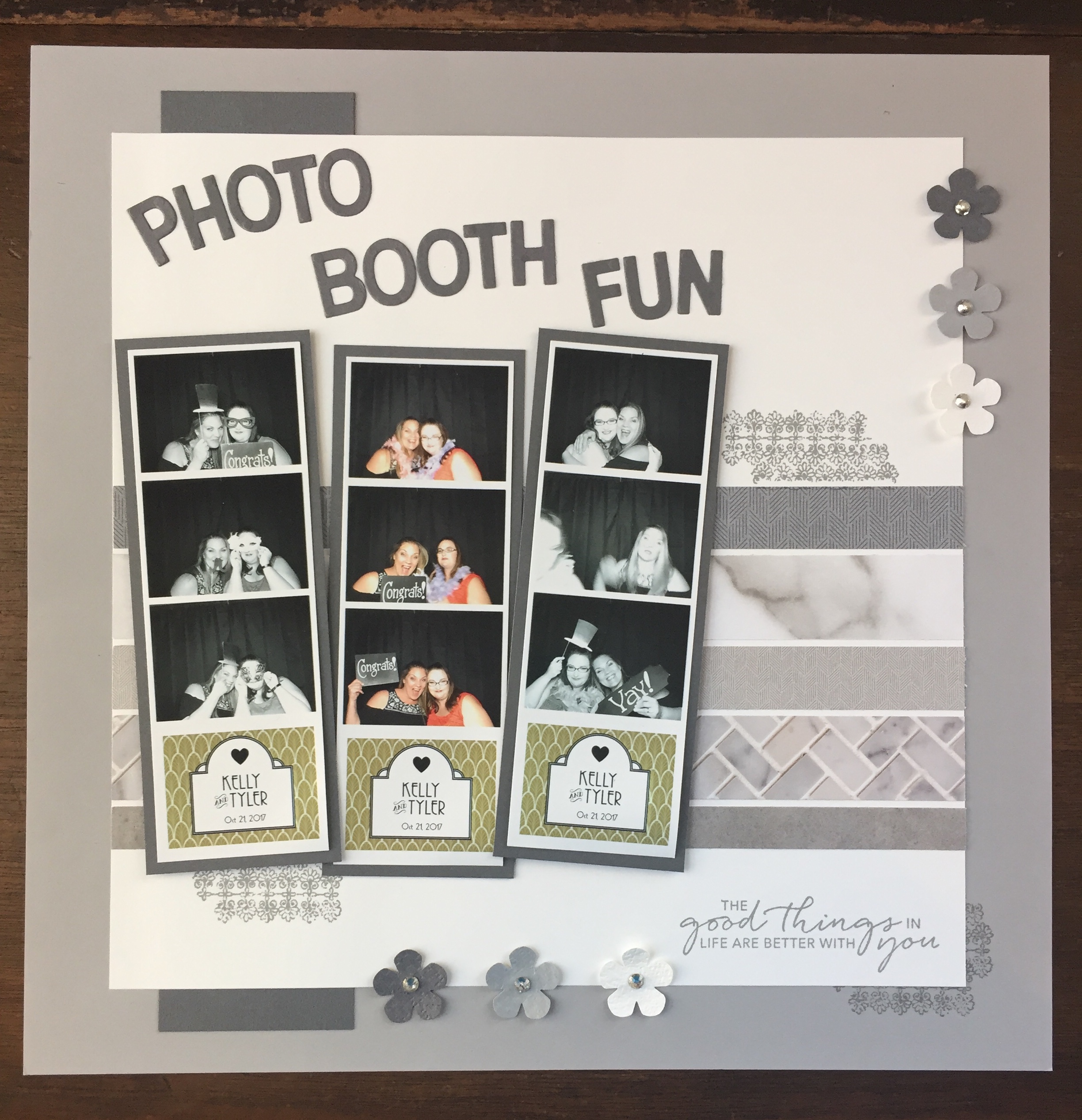
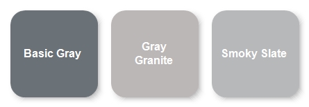
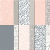
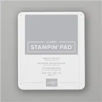
The pattern papers I used here to make the different tones of gray were Tasteful Touches Designer Series Paper and Peony Garden Designer Series Paper. They both have beautiful tones of all 3 grays that Stampin’ Up! carries. Basic Gray, Gray Granite and Smoky Slate.
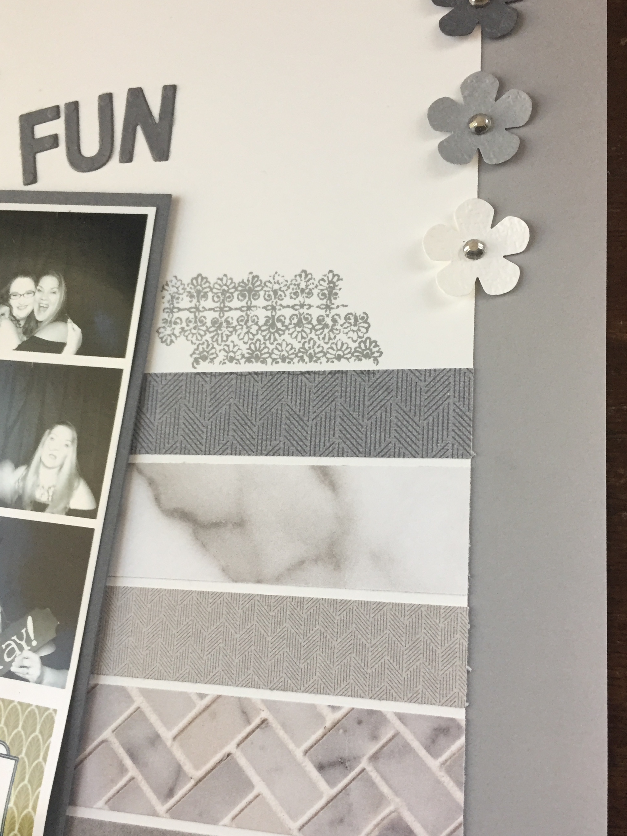
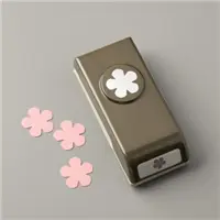
To give the flowers a little texture, I ran the cardstock through the big shot using the Tasteful Texture 3D embossing folder and then punched them out with the small bloom punch.
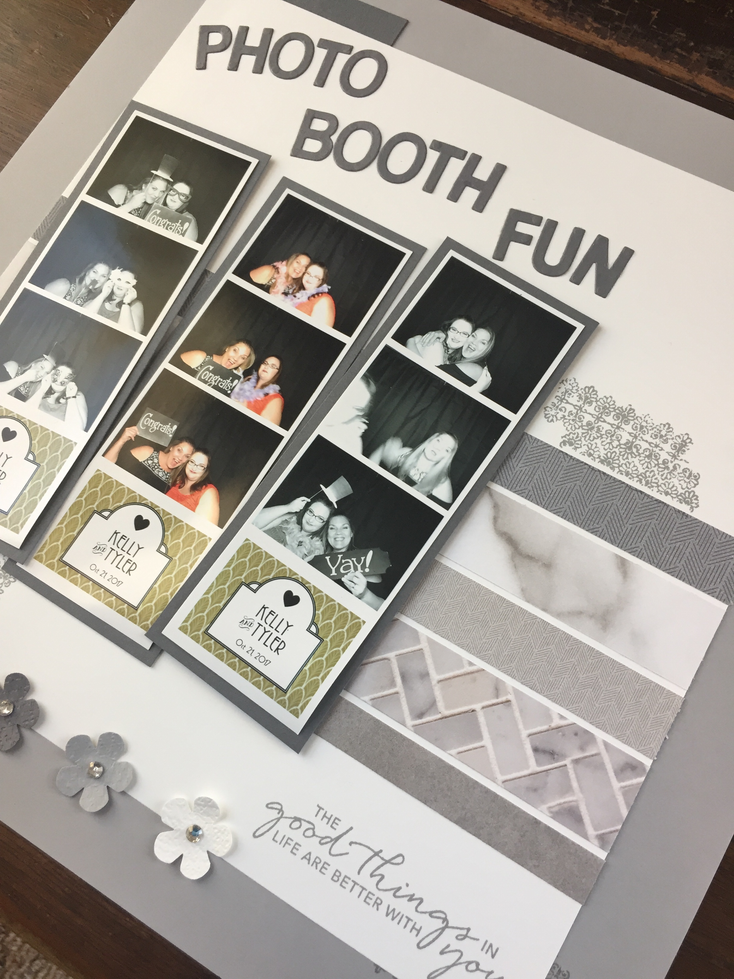
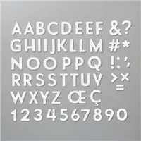
The title is die cut using some retired dies but we have some adorable dies called Playful Alphabet that will work perfectly for scrapbook pages. I have them linked below.
Thank you for stopping by my blog today. Up next is Lisa Mackey. I know she will have something creative to show you all. You can click on the next button or hop around by using the links below.




Oh your LO is just adorable and love all of your elements! Thanks for hopping with us Jennifer!
Thank you so much!
I love how you used the DSP. What a great background.
Thank you so much. That DSP is so versatile.
What a great use of the photobooth pics…you’ve inspired me…and the peony paper…so pretty!!
Thanks! Tag me when you us your pics. I’d love to see what you come up with.
Such a fun and cool layout! I like how you made the horizontal strips that mimics the photo strips!
Thank you so much and thanks for stopping by.
Love the photo strips! TFS
Thanks!
Je n’avais pas reconnu les papiers au départ. C’est top. J’aime beaucoup cette page. Ces papiers sont vraiment très doux!
Merci. Je pense que lorsque vous utilisez de plus petits morceaux de papier de modèle, ils peuvent tous regarder plus doux.
I love the way the strips of papers reflect the photo strips! Such a clever page and amazing idea with the centre photos being in colour to give an amazing pop! So much to love!!
Thank you so much. I had to have a pop of color..lol.
Jenn, this is an AWESOME use of the In Good Taste DSP… Love your lil pop of colour in the photos <3 Love your layout <3
Cheers Shaz
Thank you. This paper is the best!